Arcee Website Redesign
Arcee AI develops open-weight AI models that can be deployed across different environments, including on-device, on-premises, and in the cloud.
Artificial Intelligence
Brand Identity & Web Design
Role
Product Designer
Timeline
12 weeks
team
1 Developer, me
platform
Web

Building a Flexible Brand and Website for Open Intelligence
Arcee develops open-weight AI models that can be deployed across different environments, including on-device, on-premises, and in the cloud. Today, the company continues to position itself around openly available models that teams can inspect, customize, and run on their own terms.
I worked on a complete redesign of the Arcee website and its supporting visual identity. The project began with early brand exploration and continued through the homepage structure, high-fidelity website design, reusable components, visual assets, light and dark themes, and custom animation concepts.
The website shown in this case study represents the direction I designed during an earlier stage of Arcee’s growth. Since then, the company has continued to develop its product offering and has introduced a newer website direction.
Project Overview
Industry: Artificial intelligence and machine learning
Role: Brand and Web Designer
Scope: Brand identity, website redesign, visual direction
Deliverables: Mood boards, brand kit, low-fidelity wireframes, high-fidelity screens, light and dark themes, reusable components, graphic assets, and animation direction

Challenge
Arcee needed a new website and brand identity that could better represent its work in artificial intelligence.
The previous visual direction no longer reflected where the company was heading. Arcee needed a new logo, color system, typography, visual language, and website experience that could communicate highly technical ideas in a clearer and more confident way.
The brand also needed to appeal to several audiences, including researchers, developers, enterprise teams, and organizations exploring open-weight models.
The main challenge was finding a direction that felt:
Technical without feeling cold
Forward-looking without relying on common AI visual styles
Credible enough for enterprise audiences
Flexible across product, research, and company content
Consistent in both light and dark modes

Research and Discovery
I began by learning more about Arcee’s products, audience, competitors, and the wider AI landscape.
This involved reviewing the existing website, studying how similar companies presented technical products, and identifying common patterns across AI and developer-focused websites. I also looked at how Arcee described its models, research, deployment options, and approach to open intelligence.
The research helped identify a few important needs for the redesign:
The positioning needed to be understandable from the first screen
Product and research content needed clearer separation
Technical information needed stronger visual hierarchy
The website needed to support both short marketing messages and deeper educational content
The brand needed a recognizable visual element that could extend across pages and animations
These findings guided both the brand exploration and the structure of the website.
Exploring the Brand Direction
I created several mood board directions to help the team compare different ways the Arcee brand could look and feel.
Each direction explored combinations of:
Color palettes
Typography
Logo styles
Graphic treatments
Photography and imagery
Tone of voice
Motion references
Website composition
Some directions felt more technical and structured, while others explored a more editorial or research-led personality.
The mood boards gave the client a clearer way to discuss their preferences before we committed to the full website. They also helped us identify which visual ideas felt distinctive enough for Arcee and which ones felt too similar to other companies in the AI space.
The project went through several rounds of exploration before the team settled on a direction that felt aligned with the company’s vision.

Low-Fidelity Wireframes
The low-fidelity stage focused on layout, hierarchy, and the relationship between sections.
I kept the wireframes visually simple so the team could review the content flow without being distracted by colors, typography, or graphics.
The homepage structure included areas for:
The main positioning and call to action
Arcee’s model principles
Product and deployment information
Partner and technology logos
Research or case study content
Supporting company information
Final conversion points
This stage helped the team confirm that the story made sense before more time was invested in the final visual direction.
High-Fidelity Website Design
Once the structure and content were approved, I began building the high-fidelity homepage.
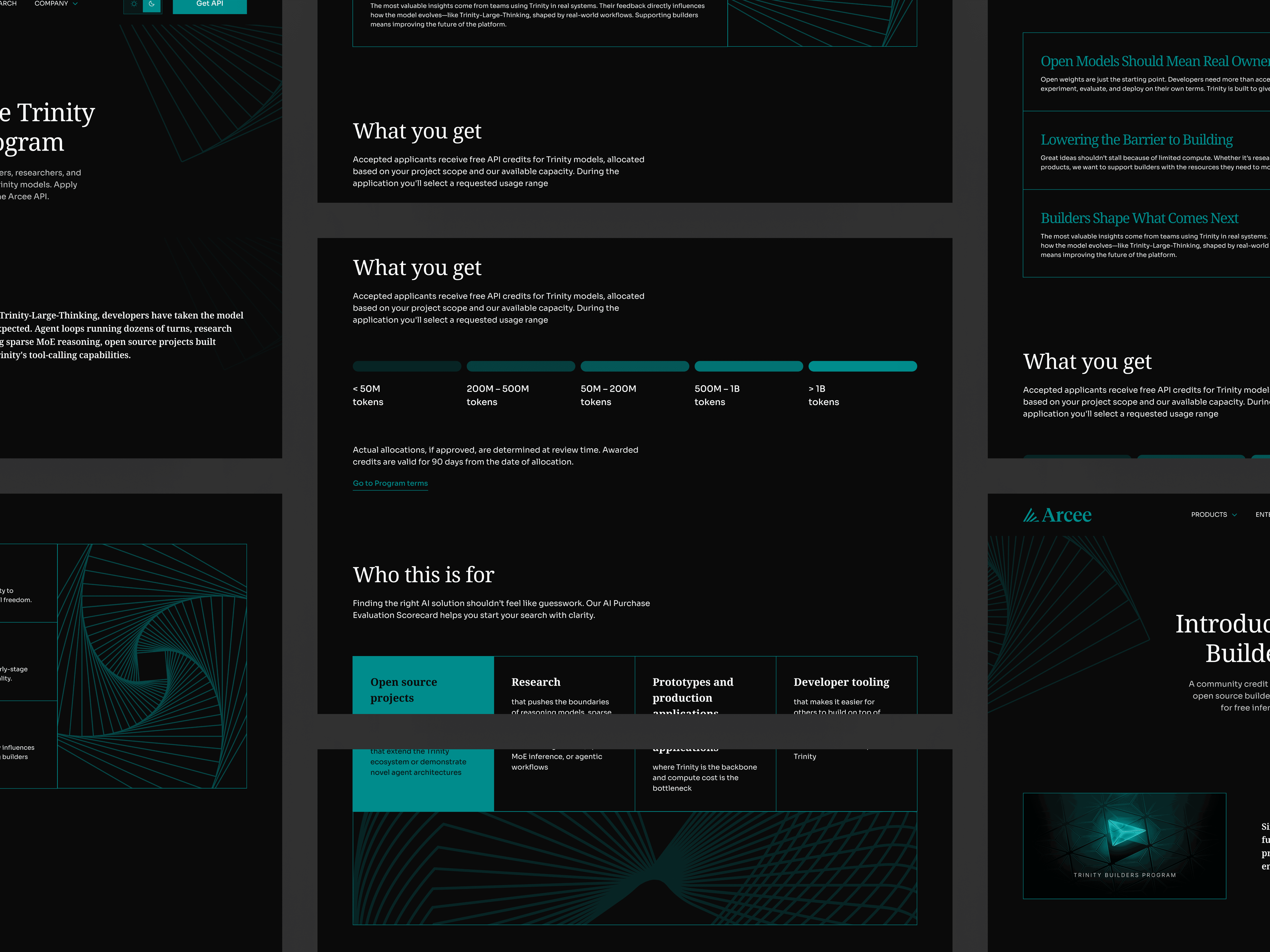
The visual direction combined large editorial headlines with structured layouts and technical graphic elements. This helped the website feel connected to research and artificial intelligence while keeping the experience easy to follow.
The homepage introduced Arcee through a focused hero section, followed by clear explanations of the company’s approach to models, its partners, and its latest content.
Each section was designed to communicate one main idea at a time. The use of spacing, typography, and simple card layouts helped break down technical information into smaller and more understandable parts.
The homepage also became the foundation for the remaining pages, allowing the same design language to be carried across product, research, enterprise, company, blog, and case study content.
Light and Dark Themes
A major part of the project was creating both light and dark versions of the website.
The 2 themes needed to feel like parts of the same identity while maintaining enough contrast and readability across different screens.
The dark version gave the brand a more technical and immersive feel, while the light version felt more editorial and open. Both used the same typography, layouts, components, and teal graphic system.
I considered how each element would behave across both themes, including:
Logos and partner marks
Buttons and form controls
Borders and dividers
Blog and content cards
Technical illustrations
Footer treatments
Hover and active states
Supporting accent colors
This required more than changing the background color. Each component needed to be reviewed to make sure it remained clear, accessible, and visually balanced.
Building the Brand Kit
After the main visual direction was approved, I organized the identity into a reusable brand kit.
The kit included:
Primary and secondary logos
Logo color variations
Typography styles
Primary and supporting colors
Image treatments
Graphic assets
Buttons and form controls
Website components
Card styles
Light and dark theme examples
This gave the Arcee team one place to access the established brand elements whenever they needed to create a new page, presentation, social asset, or marketing material.
It also helped the development team understand how the visual elements should behave across the website.
Graphic Assets and Visual System
I created custom graphics to support the website’s technical content.
The visual system used fine geometric lines, repeated forms, grids, and abstract structures inspired by models, networks, iteration, and scale. These graphics gave the brand a recognizable visual layer without relying on generic robot imagery or stock technology photography.
The assets were designed to work in several ways:
As large hero graphics
As card illustrations
As background elements
As section transitions
As supporting blog visuals
As the foundation for motion graphics
Because the graphics followed a consistent construction style, they could be expanded into new forms as the website grew.
Custom Animation Direction
Some of the visual assets were developed with animation in mind.
I worked with an animator to explain how the graphics should move, respond, and transition. This involved preparing the static designs, defining the intended motion, and reviewing the animation output to make sure it stayed consistent with the website.
The motion concepts included:
Rotating or shifting geometric forms
Lines building into larger structures
Repeated shapes responding to movement
Subtle loops for hero visuals
Transitions that suggested continuous learning or iteration
The animations added depth to the experience while keeping the overall design controlled and professional.
Collaboration and Testing
The project involved close collaboration with both the Arcee team and the developers.
I regularly presented design directions, walked through the page structure, and gathered feedback from the client. Since the branding went through several iterations, each round helped us better understand what felt right for Arcee.
As development progressed, I worked closely with the developers to review:
Layout and spacing
Light and dark theme implementation
Component consistency
Typography
Graphic placement
Animation behavior
Hover and interaction states
Testing was completed through design reviews and comparisons between the Figma files and the developed pages.
When differences appeared between the design and implementation, I worked with the development team to adjust the experience and keep both sides aligned.

Solution
The final solution brought Arcee’s identity, content, and website into one cohesive system.
The redesign introduced a clearer company position, a flexible visual identity, a structured website hierarchy, and a recognizable graphic language that could be used across both static and animated applications.
The light and dark themes gave the brand more flexibility, while the component library and brand kit created a shared foundation for the internal team and developers.
The finished experience made technical information easier to navigate while still giving Arcee a distinct and confident presence within the AI space.
Outcome and Impact
The website was successfully designed, developed, and launched using the brand direction and visual system created during the project.
The work resulted in:
A completely redesigned website
A new logo and visual identity
Light and dark website themes
A reusable collection of components
A centralized brand kit for the Arcee team
Custom static and animated graphics
A design system that could support multiple pages and content types
Closer alignment between design and development
The company has since continued to evolve its identity and website as its models, research, and positioning have grown. The current site now focuses prominently on Arcee’s open-weight Trinity model family and its broader mission around open intelligence.
The designs in this case study capture the stage where Arcee established a more complete and consistent digital identity, giving the team a foundation that could support the company’s continued growth.
Reflection
Arcee was one of the most detailed brand and website projects I worked on because it involved both creative exploration and close technical collaboration.
The biggest challenge was building an identity for a rapidly changing industry without relying on familiar AI design trends. The brand needed to feel modern and technical, but it also needed to remain clear, credible, and flexible.
Working across the identity, website, design system, and animations gave me a better understanding of how each part of a brand needs to support the others.
It also reinforced the importance of collaboration. Staying closely aligned with the client, developers, and animator helped turn the final design into a consistent live experience.
