Sirge Website Redesign
Sirge is a growth platform created to help Shopify brands understand their performance, organize their marketing data, and make more informed decisions about their stores.
E-commerce Technology
Brand Identity & Web Design
Role
Product Designer
Timeline
8 weeks
team
1 Developer, me
platform
Web

Building a Bold and Playful Brand for Shopify Growth
Sirge is a growth platform created to help Shopify brands understand their performance, organize their marketing data, and make more informed decisions about their stores.
I worked across the brand and website experience, from the earliest visual explorations through to the final design system. My work included mood boards, logo exploration, brand guidelines, website design, reusable components, custom graphic assets, and the face mascot used throughout the Sirge brand.
The project went through several rounds of exploration before we arrived at the final direction. The Sirge team was closely involved throughout the process and had a clear sense of the personality they wanted the brand to have. Their hands-on approach made each round of feedback focused, collaborative, and productive.
Project Overview
Industry: Ecommerce and Shopify technology
Role: Brand and Web Designer
Scope: Brand identity, art direction, website design
Deliverables: Website UI, reusable components, graphic assets, and mascot design
Challenge
Sirge needed a visual identity that could make e-commerce analytics and growth tools feel easier to understand.
The platform worked with topics such as marketing data, conversion performance, store audits, and growth recommendations. These subjects can quickly feel technical or overwhelming, especially for merchants who are already managing many parts of their business.
The brand needed to feel credible enough for growing Shopify businesses while still being friendly, energetic, and approachable. It also needed to be flexible enough to work across the website, product graphics, educational content, campaigns, and future marketing materials.
The main challenge was finding the right balance between:
Playful and professional
Bold and easy to use
Technical and approachable
Expressive and consistent
Building the Visual Identity
After selecting the core direction, I developed a broader visual system that could be applied consistently across the brand.
The identity used a bold combination of purple, yellow, and softer supporting colors. The contrast helped Sirge feel energetic and recognizable while still giving the content enough space to remain clear and readable.
Typography also played an important role. Large, expressive headlines gave the brand a strong voice, while simpler supporting styles were used for longer content, labels, and actions.
The visual identity included:
Primary and supporting color palettes
Typography hierarchy
Logo variations and usage
Buttons and form styles
Cards and website components
Icons and small illustrations
Decorative shapes and section dividers
Graphic treatments for product concepts
Guidance for maintaining consistency
The goal was to create a system that felt playful without becoming difficult to use. Each element needed to have a purpose and support the overall experience.

Creating the Sirge Mascot
One of the most recognizable parts of the identity was the Sirge face mascot.
The mascot was created to add warmth and personality to a product centered around data, analytics, and e-commerce performance. It helped make the brand feel more human and gave Sirge a visual character that could appear throughout the website.
I explored different face shapes, expressions, and levels of detail before reaching the final style. The design was kept simple so it would remain recognizable at both large and small sizes.
The mascot could be used in different ways, including:
Introducing new sections
Supporting calls to action
Celebrating results or milestones
Adding personality between content blocks
Helping explain more technical ideas
Creating small, memorable moments throughout the website
It became an important part of the visual system and helped connect the different sections of the website.
Graphic Assets and Components
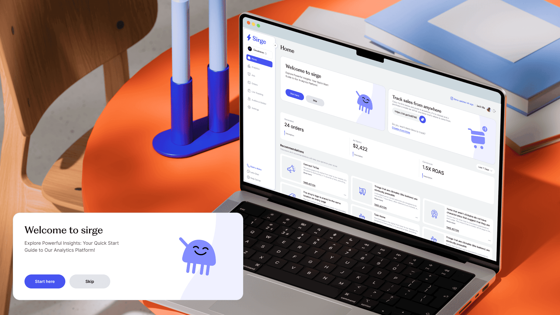
Alongside the main identity, I created custom graphic assets that translated Sirge’s product and services into more visual stories.
These graphics represented ideas such as ecommerce growth, store performance, marketing data, competitor insights, personalized recommendations, and connected platforms.
The visual assets combined product-inspired interface elements with playful illustrations and strong blocks of color. This made the platform’s features easier to introduce without relying on large amounts of technical copy.
I also designed reusable website components, including cards, buttons, form elements, content blocks, testimonials, feature sections, and calls to action.
Building these as a connected system helped maintain consistency across the website and made it easier to create new sections as the content developed.
Website Design
The website brought all parts of the new identity together.
The experience used bold typography, expressive graphics, product visuals, and structured layouts to explain what Sirge offered Shopify brands. Each section focused on one key message at a time so users could move through the page without feeling overwhelmed.
The homepage introduced the product through a strong hero section, followed by clear explanations of how Sirge could help merchants manage their e-commerce data, understand performance, and identify opportunities for growth.
Custom graphics were used throughout the page to support the content and make technical ideas feel more approachable. The purple and yellow palette gave the experience a strong visual rhythm, while the mascot added lighter moments between the more detailed product sections.
The main design priority was keeping the website expressive while still making the content easy to follow.
Collaboration and Iteration
The Sirge team was closely involved throughout the project.
They had a clear vision for the personality they wanted the brand to communicate, which made the collaboration open and productive. Their feedback helped guide the mood boards, logo explorations, color choices, illustrations, and website direction.
The project required many rounds of iteration, but each round brought the identity closer to something that felt distinctly Sirge.
Working closely with the client also allowed decisions to be made with a clearer understanding of the product, audience, and long-term direction of the brand.

Solution
The final direction gave Sirge a bold and approachable identity that could communicate technical ecommerce concepts in a more engaging way.
The logo, colors, typography, mascot, graphic assets, and components were brought together into one consistent visual language. This system was then applied across the website to create an experience that felt recognizable, energetic, and easy to follow.
The identity gave Sirge enough structure to remain professional while allowing the brand to show more personality than a typical e-commerce analytics platform.

Outcome and Impact
The completed work gave Sirge a complete visual foundation that could be used across its website and supporting marketing materials.
The impact of the project included:
Establishing a clear and recognizable brand identity
Creating a cohesive design system across the website
Making technical e-commerce topics feel more approachable
Developing a flexible mascot and illustration style
Creating reusable graphics and website components
Providing a visual foundation for future pages and campaigns
The final website brought the brand and product together in a way that felt more memorable and engaging for Shopify merchants.

Reflection
Sirge was a valuable opportunity to work across nearly every part of a brand experience, from early creative direction to the final website.
One of the most important parts of the project was learning how to balance a playful visual identity with the clarity expected from a technology platform. The design needed to feel expressive, but it also needed to support the content and make the product easier to understand.
The close collaboration with the Sirge team made the process especially rewarding. Their clear feedback and involvement helped shape a final direction that felt aligned with their vision while giving the brand a strong and flexible visual system.
